|
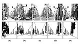
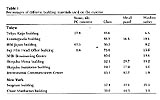
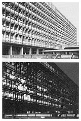
Ashihara Yoshinobu Final Lecture: Department of Architecture, University of Tokyo February 2, 1979 (translation by Lynne E. Riggs) Part 3 The Townscape and the Appearance of Architectural Exteriors If we take further the ideas explored earlier in relation to the Gestalt ideas of figure and ground, where does it take us? It prompts us to examine, for example, the conditions of walls that are the borderline between interior and exterior space through analysis of the townscape. This has always been a matter of great fascination to me, particularly the condition of the exterior walls of buildings in Japanwith their sense of the transitory as expressed in the essay by ancient Japanese poet Yoshida Kenkoand the fluid quality that makes the surface difficult to grasp. In terms of the Gestalt relationship between figure and ground, the outlines of space are quite blurred. Examples are readily found in the central shopping and entertainment districts of our cities, and this is what led me to analyze the townscape of Ginza. I made an actual count of the perpendicular signboards (sode kanban) in a certain stretch of Ginza Avenue, and found that, while the exterior walls of buildings ought to be what defines the shape and [what Kevin Lynch called] the imageability of the townscape, in Japan, these walls are often all but obscured by these signboards. If signboards like this project one meter from the building, depending upon the angle of vision, the wall may be hardly visible. The further the distance from the building, of course, the more of the wall can be seen. We counted the signboards in a 900-meter portion of Ginza Avenue between the 1st and 8th blocks. The signboards are placed one above another in vertical rows, so the effect can be gauged by counting the rows rather than each individual signboard. There were 111 rows on the west side and 88 rows on the east sidethe presence of a department store diminished the number somewhatwhich calculated out to about 1 row of signs every 10 meters. Thus, as you are walking down Ginza Avenue, the fronts of the buildings do not leave much of an impression.*7 We can see how the amount of wall visible differs if we look at these photographs taken from a distance of 3 meters away from the walls of the buildings on the sidewalk (a), then from 6 meters away (b), from the center of the street (c), from 6 meters from the opposite side of the street (d), and from 3 meters away on that side (e). This is the case for a street like Ginza Avenue that is 27 meters wide. Now, what happens if we black out the area occupied by the perpendicular signboards in the photograph? From the center, there is a rough balance between the left and right, and the wall surfacewhich is this white area, hereis more or less visible. Now, standing 3 meters out from the wall, as in this one, almost the entire wall is blacked out; on the other side of the street, the situation is just about the same. Well, what this shows is of course quite obvious, but it impresses upon us the fact that as long as there are these signboards, if the street is wide, the further away from the wall one can get, the stronger becomes the impression of the wall. Only when you are standing in the middle of a crosswalk or intersection, or when you can walk into the middle of streets that are blocked off for pedestrians, can you get a clearer perception of the space of a townscape. What this experiment shows is that exterior walls, the borderline between inside and outside, are rendered quite fuzzy in Japan, and I believe this can be demonstrated in literature as well as in painting. When Japanese artists go to Europe, you may noticesuch as to Paris, Venice or Romethey paint quite excellent landscapes. But when they come back to Japan, they cant paint. The reason they cant paint the townscape in Japan is because of what I have demonstrated here. You can call the wall surface of building frontages the primary profile while the protruding or temporary objects alongside themthe telephone poles, signs, the fluttering banners, portable sales booths set on the sidewalk, etc.form the secondary profile. In Japan, the townscape is dominated by this secondary profileindeed, in some cases the secondary profile is all you can see. And when you set to try to paint a picture of such a townscape, it is like trying to get a look at the face of a beautiful woman that is hidden behind a layer of bandages and gauze! No wonder it may be easy to draw a townscape in Europe and impossible in Japan. In literature as well, as pointed out by Okuno Takeo,*8 writers like Natsume Soseki were once able to create vivid scenes of locales like Hongo or Shitaya, but more recently, writers might try but often fail to be able to capture a sense of the townscape. It is no wonder they cannot, because it is impossible to get a grasp of where the outlines are, and this is because the relationship between the inside and outside of the architecture is lacking in any sort of Gestalt contrast, and the relationship between figure and ground is seriously blurred. Regarding the exterior appearance of architecture, I have undertaken various studies with the graduate students, one of which, for example, as organized in the chart at left, shows the percentages of stone (or tile/PC concrete), glass, and metal panel in the exterior of buildings in Japan (Tokyo Kaijo building, Kasumigaseki building, IBM Japan building, Fuji Film Head Office building, NHK Broadcasting Center, Shinjuku Mitsui building) and in New York (Seagram building and Chase Manhattan bank building). Now, if we look at a building, there are cases when the window sashes protrude and where they are recessed. If you look at the building from an angle you can see the parts that maintain strength here, and the protruding window sashes, producing an effect much like the perpendicular signboards discussed above, and rendering the glass surface difficult to see. When these elements are recessedsuch as in the Mitsui building in Shinjukuthe glass surface is easy to see. The external appearance is determined not only by factors like the proportion of glass, stone, or metal panel used but by the character of the window sashes. Many buildings may give a predominant impression of glass surface when viewed front on, but when viewed from one side or other, the glass surface becomes very difficult to see in some buildings and easy to see no matter where you stand for other buildings. Looking at the Seagram Building, a beautiful structure standing on New Yorks Park Avenue, you can see how Mies van der Rohe designed this with vertical mullions protruding 16-centimeters, while the horizontal spandrels are roughly flush with the building. Looking up from below, you can see the clean vertical surface; however, if you move to the side, it becomes difficult to see the glass, for the reasons mentioned earlier. It is worth noting that the entrance to the Seagram Building is in the center and there are ponds on both sides that prevent one from gaining a vantage point at either the right or left. This arrangement is convenient for gazing up and down the building but not for viewing it from the side. By contrast, the old Tokyo Metropolitan Government building had deep overhangs for each floor, so that in the daytime, it exhibited very sharp and impressionable contrasts of light and shadow. At night, however, because of the deeply projecting overhangs, it is difficult to see the glass surface when looking up from below, so the figure-ground contrasts created are considerably blurred. In the case of the Seagram Building, there is nothing protruding sideways, as noted above, only vertically, indicating that Mies had the nightscape in mind when he designed the building. I also worked with graduate students here at the university in studying the urban nightscape. When we look at a building in daylight, we are most conscious of its external walls, and the windows appear as black shapes recessed into the surface. At night, by contrast, when it is dark all around, the external walls are all but invisible, and the lights come on in the windows, whose outlines are now clearly visible. We observed such buildings at distances of 100 meters, 200 meters, 300 meters, and 400 meters. Observing the skyscrapers in Nishi Shinjuku, for example, at about 100 meters, we can see the florescent light tubes glowing and the actual shape and nature of the windows. However, as we back away, from a distance of about 800 meters, the florescent lights and window fixtures cease to be visible, until a kind of Gestalt emerges in which the white lights glow as distinct shapes. In almost all cases, the figure-ground reversal was complete at a distance of about 800 meters. A beautiful nightscape is an important matter to a city. When we think about neon lights, we architects have put great thought into the proportions of a building or its penthouse, and the last thing we want stuck on our design is a neon sign. However, it is those last-thing-we-want-to-see neons that light up the city so beautifully at night. The reason they are so very striking, of course, is extremely simple: as I observed earlier, when night falls, the buildings are no longer visible. Only the neon lights emerge, glowing against the darkness. It is as if a woman attractively dressed in kimono were to don an outlandish hat festooned with feathers. If one couldnt see the kimono well and saw only the hat, it might not be so bad! What is important is how the building looks at night. Gothic buildings are beautiful by day; like Baroque architecture they display deep contours and are quite striking. Unfortunately, after night falls, they are generally reduced to lumps of stone. It is probably quite recently, in fact, that architects began to design consciously for a citys nightscape, possibly around the time the Seagram Building was built. There are indications that Mies put a lot of thought into the matter. I have heard, albeit indirectly, that the lights in the building are controlled from one switchboard; they cannot be turned off independently in each office or room. Considered from the viewpoint of a Gestalt aesthetic, the architect would not want to have the lights going off and on in the windows at random. There were also various rules that had to be observed, such as not to place items within so many meters of the windows and not to install curtains. Indeed, when we note the details, we can see how the windowsills have been made very low, the air conditioning units along the windows have been sunk into the floor and made very low. It is thus a beautiful building, even when the figure-ground Gestalt is reversed at night. When we consider the lines that define the shape of a building and the nature of the exterior wallsthe matter of the primary and secondary profiles mentioned earlierwe find that those features play an important role in the nightscape as well. We need to think about how such exteriors should be handled. The boundary line between exterior and interior is extremely permeable, with surfaces that attract and absorb as well as surfaces that repel and shut out, that can flow in and flow out like an amoeba. In short, I believe that the nature of the lines that form figure and ground carry very important meaning in determining the exterior of architecture and of the townscape. *7. For further detail, see The Aesthetic Townscape, pp. 78-83. *8. Okuno Takeo, Bungaku ni okeru genfukei [The Primal Setting in Japanese Literature]. Tokyo: Shueisha, 1972. |